

In today’s fast-paced market, the value of experimentation is often overlooked, with the focus largely being on faster production and delivery. Moodboards have become the go-to starting point, created before sketching or developing any project to minimise the margin of error. This often leads to visuals inspired by previously created ones, which in turn are influenced by even earlier works.
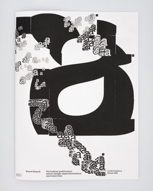
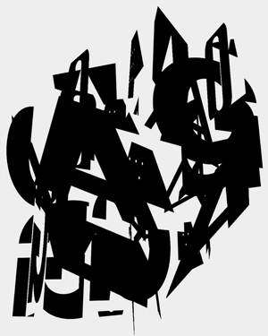
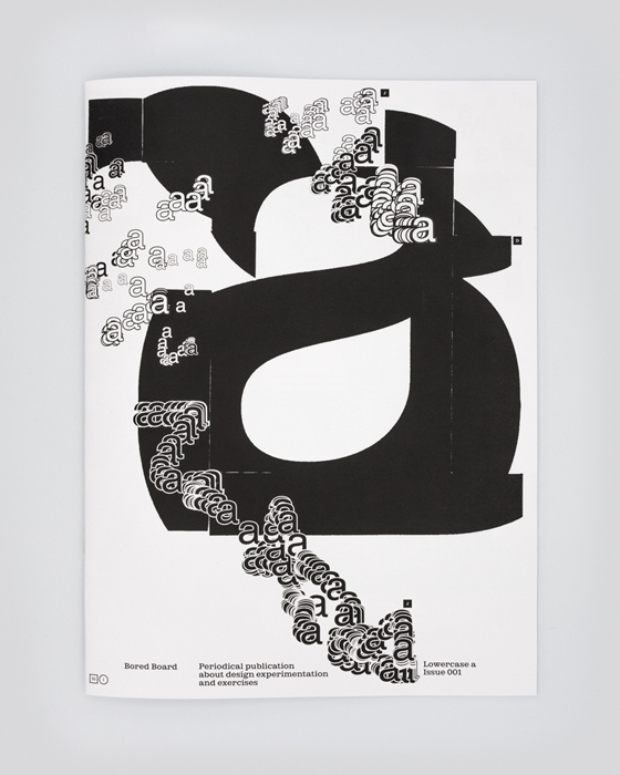
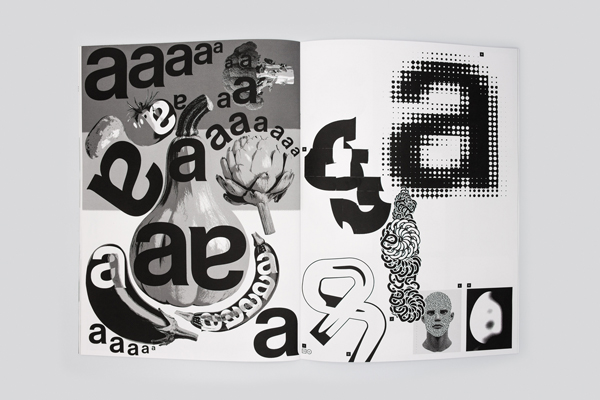
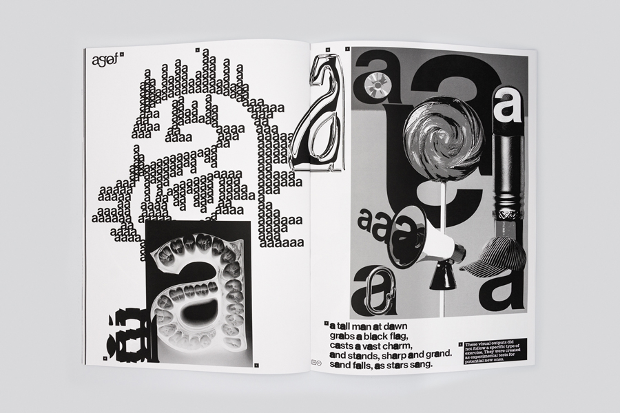
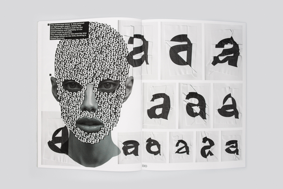
In this scenario, Bored Board is intended as a pause, a way to step back and reassess our approach to designing. The starting point and subject of this first issue is the lowercase letter ‘a’.
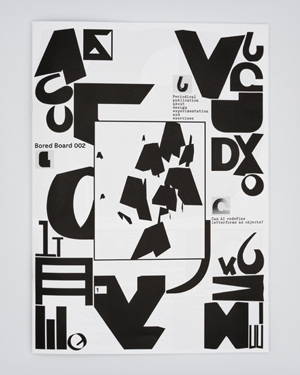
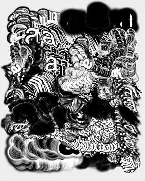
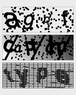
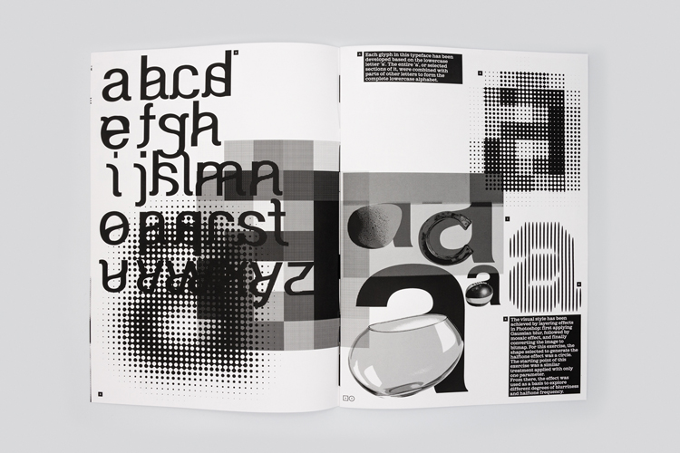
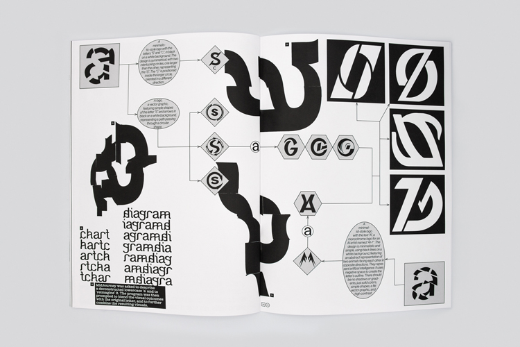
The exercises featured in this issue share an approach that aligns with the spirit and rhythm of this publication. They are: —part of an ongoing visual research project that began years ago; —inspired by other disciplines, like art and photography, with a focus on using specific effects, or treatments as starting points to further develop and expand through typography.
Editorial
Publication design
Illustration
AI-generated content
Java tool
Distribution: SPREAD Body copy: ES Park by Extraset Paper: Gmund Blocker Perfect White Printed by: F. E. Burman